
Layland
Branding
Layland, a RV park and campground with locations spanning across NY, MA, and PA, offers a glamping experience that blends comfort with adventure. The rebranding aimed to capture this essence, ensuring it remained inclusive and welcoming, rather than exclusively targeting upscale clientele. Drawing inspiration from brands like Sweetgreen, the color palette exuded vibrant and inviting energy. Iconography and visuals were deliberately crafted with thick, rounded lines to evoke friendliness and approachability. This project was done between Dev Gupta and me.


Website
The website mirrors Sweet Green's color palette, featuring forest green accented with vibrant pops of electric yellow. For sake of simplicity, all illustrations adopt an iconographic style. Engaging taglines were strategically employed to captivate customers and draw them in.

Logo
The previous logo mark had issues with unevenness and roughness. The primary focus was on fixing the consistency of stroke thickness and weight.
Dev Gupta refined the smoothness of the word mark, and I also introduced an additional letter mark where the two LL's connect.
Map, Handbook, and Menus
A significant amount of printed material was essential to support the camping experience.
Initially, the campground map was overwhelming, displaying all RVs and cabins, resulting in visual clutter. To address this, we opted to segment specific sections by color-coding them and utilizing distinct icons to denote various areas.
Furthermore, we revamped the layouts to ensure consistency across all information-heavy documents.


Icons
Previously, the brand utilized custom-drawn icons, but it was determined that moving forward, they didn't need to be overly stylized. To streamline the process, we utilized icons from the Google Icon Library, opting for thicker outlines for a bold look. Additionally, I created custom icons tailored to specific locations, ensuring a cohesive visual language across the brand.


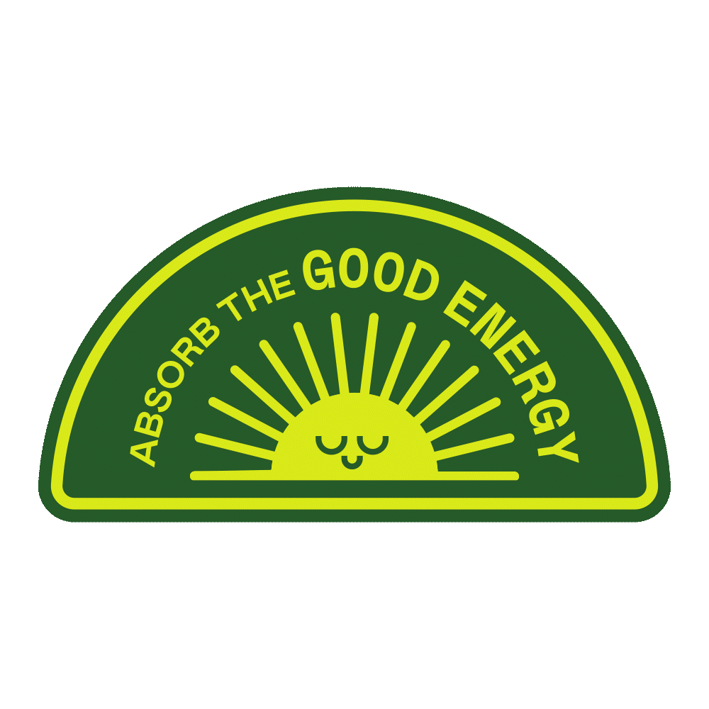
Badges
These badges are a neat way to spruce Layland’s identity. They can be used for social media tiles, be turned into stickers, or even be placed on top of photos.

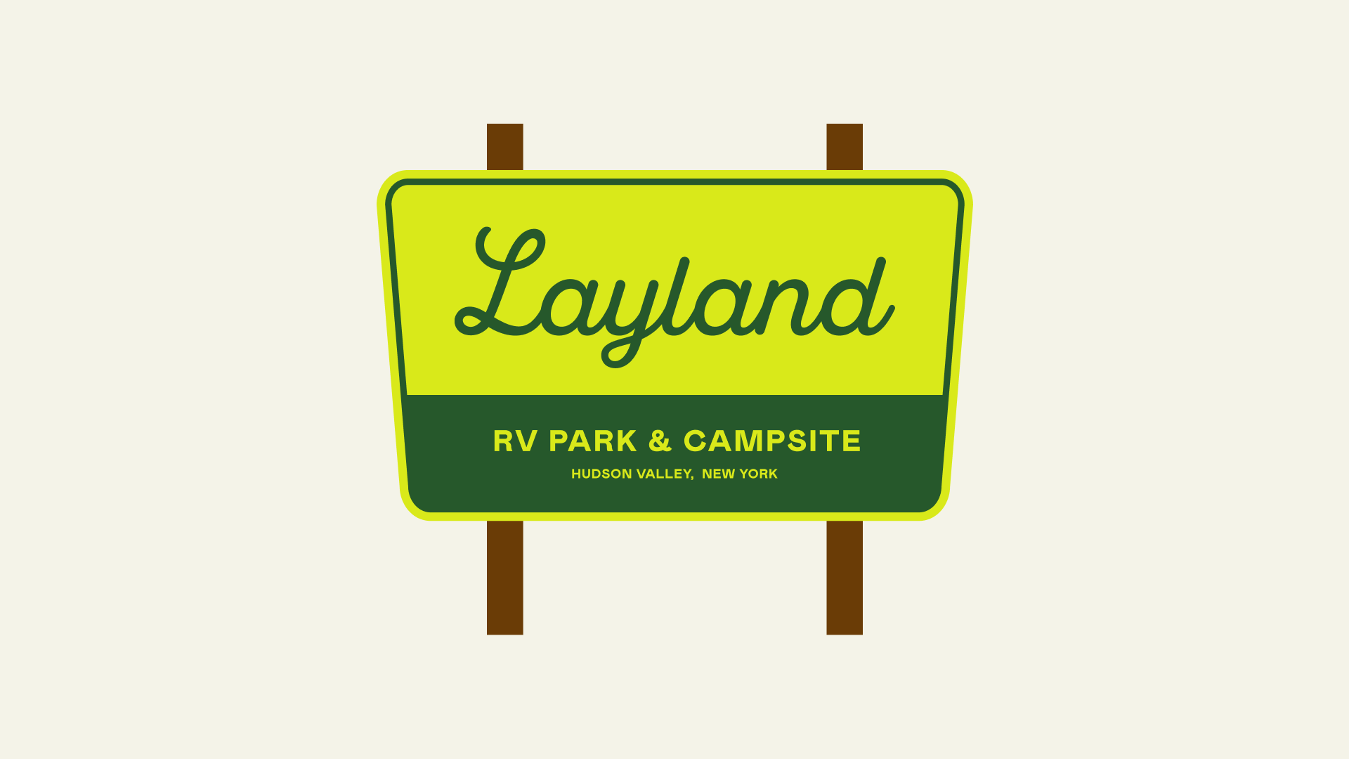
Signage
At the entrance of Layland, a distinctive sign welcomes visitors to the campgrounds. Drawing inspiration from the iconic signage found in US national parks, I opted for a trapezoid shape rather than a traditional rectangle.

Social Media
The proposed aesthetic for Layland's social media channels combine the brand's photography, catchy phrases, and distinctive badges, creating a cohesive and engaging visual identity.
